Improving conversion for a tech agency
4 years span from the creation to the iteration of their website. A tech agency that started from helping various business with their online presence with a very strong tech aesthetic, and found his niche two years after the launch.
Industry
Tech
Client
Hyuman Tech
Service
Web Design
Date
May 2024
Challenge
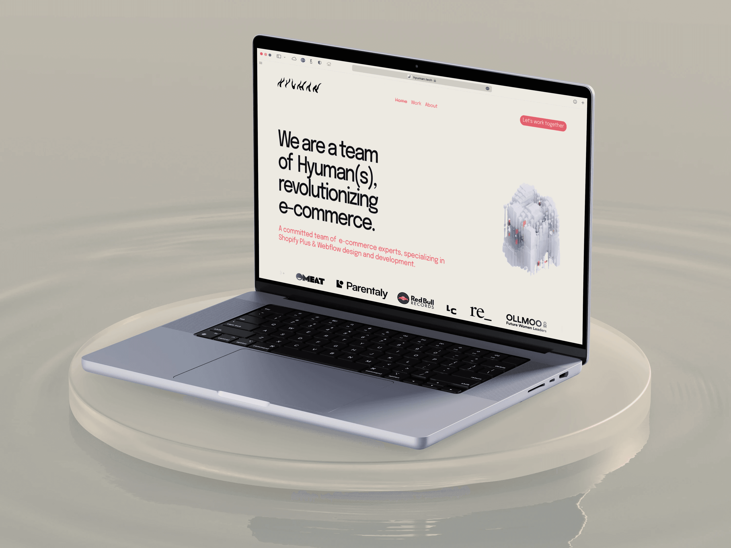
In 2022 I've been contacted By Ranieri, founder of Hyuman Tech to design a website for his tech agency to showcase services, past project, and increase clients conversion. In 2024 after two years of work, I've been requested to update and rebrand the Hyman tech website, changing the face, the tone of voice and appearence of the website.
Goal
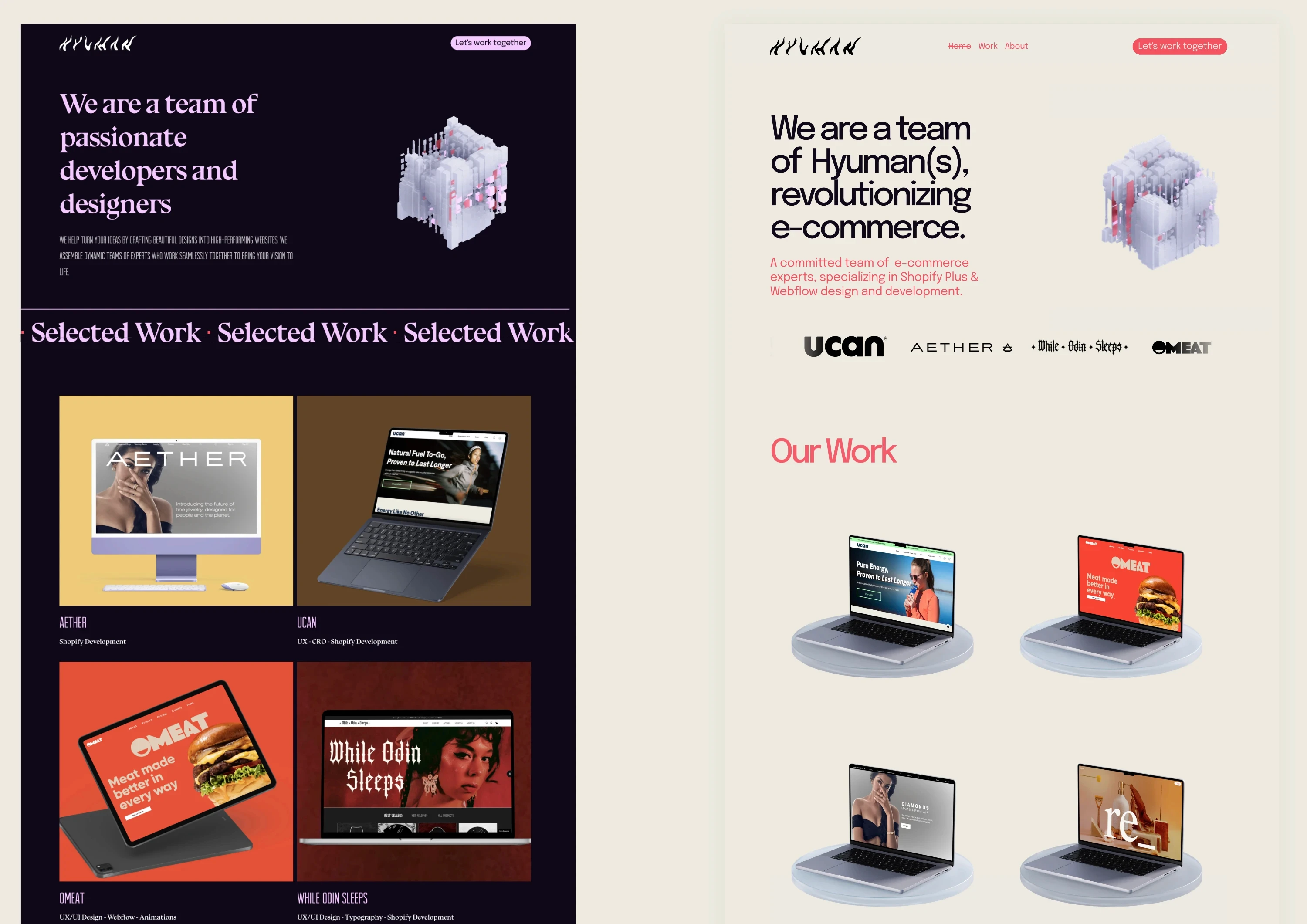
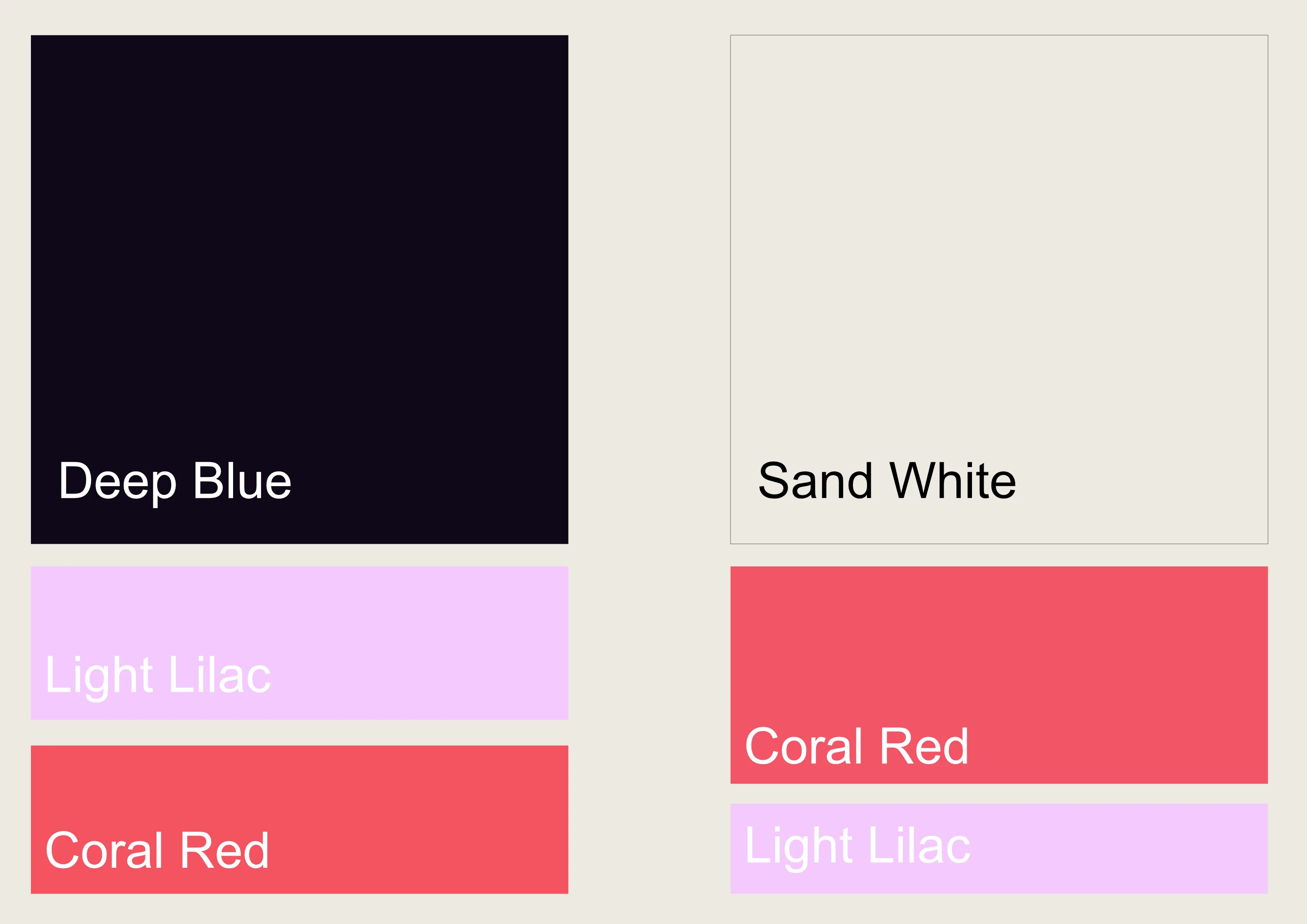
The initial goal was to show a very tech-oriented image, but with a twist to stand out. The colour palette choosen was predominantly darker with hint of pink, red and white. The website was a one page style layout expressing the goal of the company, showcasing services, past clients, and a Calendly intergtation to boost contact with clients. In 2024 the company evolved, focusing on his niche and opting for a different approach. While still very tech powered the request was to have a more light and welcome approach, a more structured homepage, and two additional pages for About and all the works.
Solution
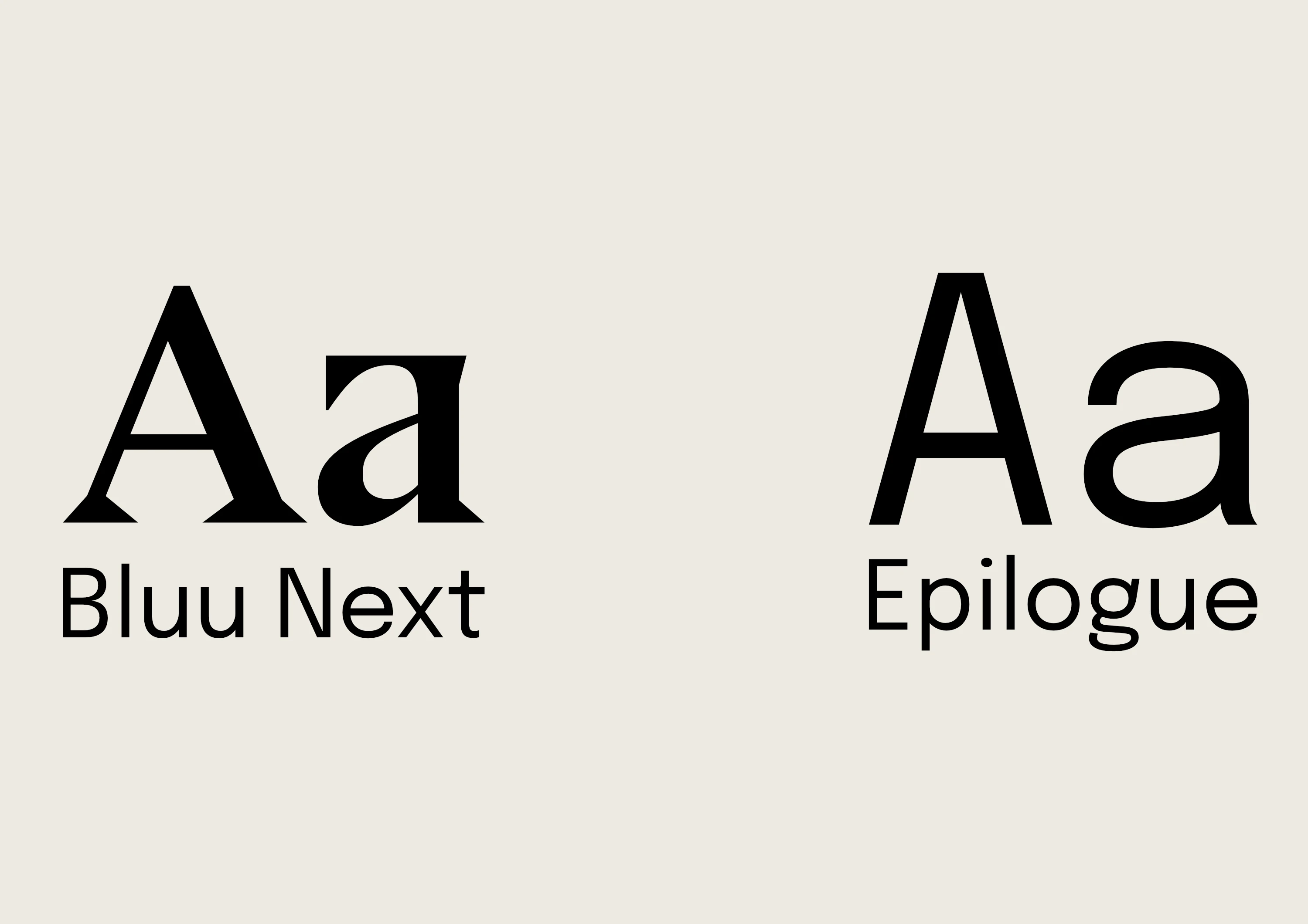
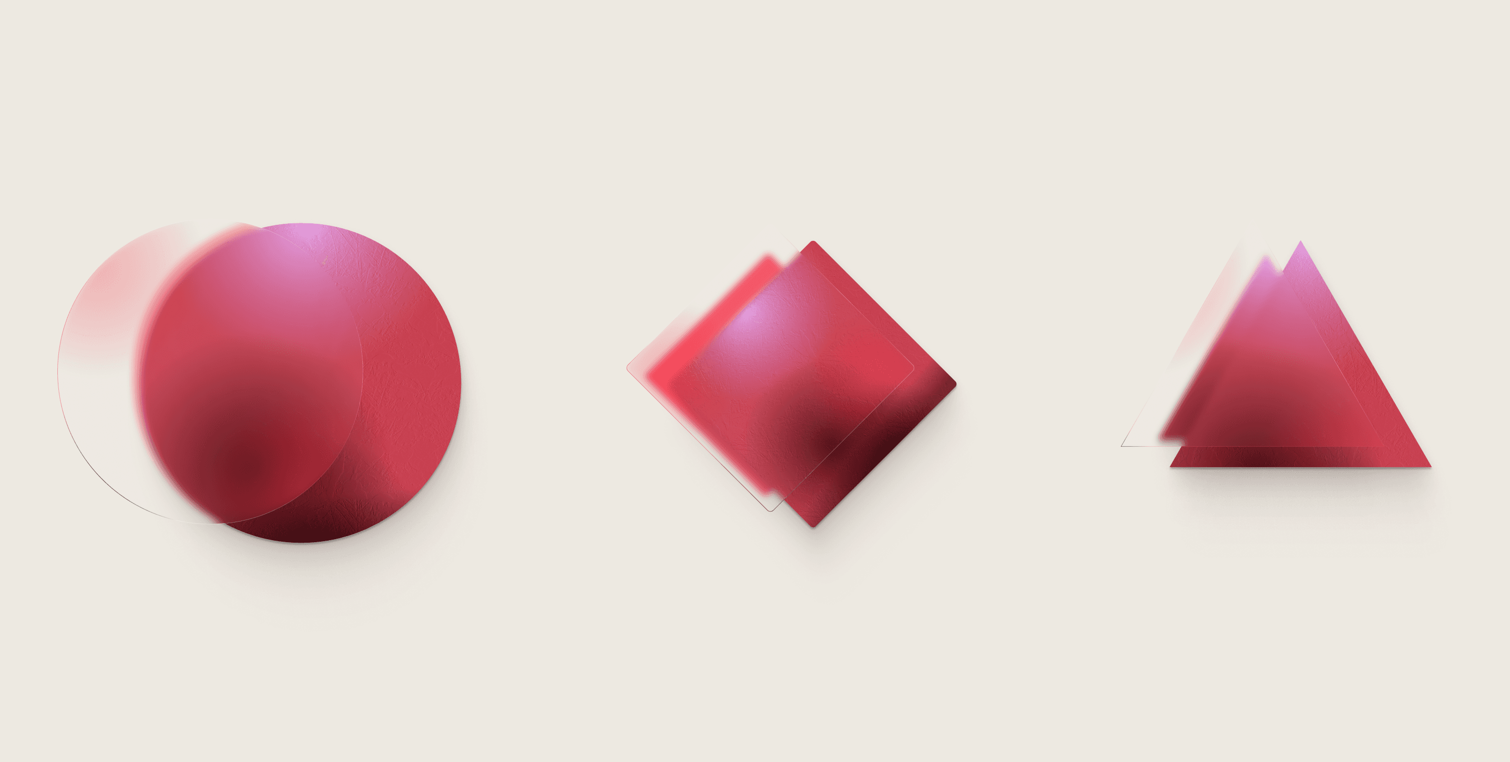
The solution proposed for the rebrand was to approach a lighter colour palette, svitching the deep blue with a more sand-ish background colour. A new font family has took place with a more traditional and accessible sans-serif for both headline and subtitle, while the body copy remain the same. To increase the scalability in the future a CMS has been added to the website, to facilitate the creation of more projects, following a template, reducing the time and increasing consistency.
