February 2019
Building a new feature for the Strava app — a UX case study
Case Study
Introduction
Strava is a gps based app that help you track your training, speed, distance, altitude and time you spent out practising your favourite sport.
Strava turns every iPhone and Android into a sophisticated running and cycling computer
In this exercise my goal was to add a feature to the existing Strava app.
The feature was Create a route for me.
The time given to complete the project was 5 days.
Research
At the beginning it was not so clear how to start. So I decided to do some brainstorming around the feature.
Why the users will use it, what type of user will use it, where they would use it and last but not least, would they use it?

After the brainstorming, I wrote down some questions for the interviews, this step help me to test if my brainstorming was on the right path or no.
Survey
My survey was short, only 5 closed questions, and the results were very interesting! There was not so many divisions on the answer, look like people use this app in a similar way.

Once I had a useful amount of data from the survey wrote down the answers and I created the Affinity diagram, that show me important facts:
There is a big community behind the app, and people use a lot, 95% of the user answer that they use every time practice sports;
The users tend to choose the route based on the distance instead of difficult
They are curious, prefer change route every time and react with positive answer to the new feature.
Problem statement
The user need to choose a different route every day based on his settings without loosing time planning it.
User persona
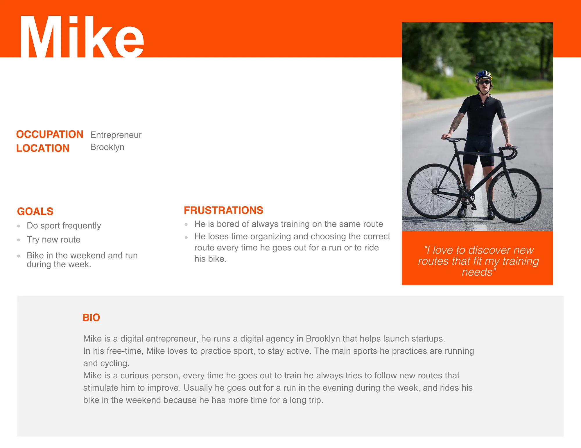
From the research made, I developed my user persona, Mike, a digital entrepreneur from Brooklyn.

Heuristic analysis
I made a heuristic analysis of all the screens that involved my flow, it was not requested by the project rules, but I decided to do it anyway to improve the usability of the app and challenge myself in a side challenge.
Based on my analysis the app have a strong social side.
The strategy of Strava designers is to motivate the users by engaging with the community. Showing the friends progress
This is just my assumption, and I’m not saying that is a wrong direction.
Competitive analysis
Competitive analysis help me understand the flow of the app and what was the best place to place my new feature.
If you are interested in learning more about my analysis you can read the complete article here
Paper prototype

Finished the heuristic and competitive analysis, I did a quick sketch to transfer my ideas to the paper than I start drawing the prototype, create the flow and then test it.
Iterations
After six test I collected a lot of information from the users.
For reason of time I decided to apply only two, that was the most important for my flow and my feature.At the beginning the new feature was designed to offer only the distance as a main variable for choose a new route.
Some users, after testing the app, ask me “what about if instead distance I want to choose my route based on the time I have?”So I added a switch that allow the user choose between distance, time and a tagline with different categories of road.

This page is part of the new feature I added to strava app. The first design show the user a track suggested by the app. A refresh button positioned in the low right corner allow you to change it, but again, how can I came back after refresh the map if I don’t like the new map?
So I decided to adopt a card system, where the app suggest you more than one options, and the user can swipe back and forth to choose the best route for him.

The final prototype
Ok, now immagine Mike, during the weekend, he decide to go out for a bike ride as every weekend.
Mike open Strava on his iPhone, select record new activity, and a new icon appear on his right. A road, so Mike click on it and the app show you a totally new screen, with a difficult tag picker, a distance and a time picker. The only things Mike have to do is choose the best settings that fits his needs and press GO!
After the app will show him some route based on his settings, once chosed one, Mike is ready to go.
MY RECENT STORIES
Product Design
August 2024
